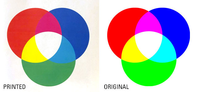
QUESTION: Why do the colors in my printed logo look different from the colors I see on my computer screen?
Short answer: Well… there isn’t really a good “short” answer. Discrepancies in the way colors display on a screen versus the way they appear in print are typical because you are comparing different color spaces.
For the long answer, let’s start by talking about colors—RGB, CMYK, and PMS.

RGB should be used for screen only, because the Red/Green/Blue color combination refers to colors of light. The use of all three colors together at higher intensities results in white and lighter tones, while black is produced with less light against the darkened screen. Layering the three base colors of light at varying amounts creates the differences in hue.
So, on screen, RGB colors should look “correct” … though it can be greatly influenced by the color calibration of the monitor or screen you are using.
CMYK is used for printing, because the Cyan/Magenta/Yellow/Key(black) color combination refers to colors of ink. Layers of CMYK ink are laid in varying densities to create tonal differences—the less ink, the more white that shows through, creating a lighter tone. This is also sometimes called “4-color process”. Like mixing paint, combining the four base colors at varying amounts creates a limitless number of hues.
So, in print, CMYK colors should look “correct” … though it can be greatly influenced by the color calibration of the printer you are using.


Colors from the Pantone® Matching System, or PMS colors are created with pre-mixed ink, resulting in the most consistent color possible. Because we’re talking about ink (and not light), PMS colors are only used for printed pieces.
Because these are pre-set colors, not every color is possible. CMYK and RGB can be mixed to make millions of colors, but there are only about 2,000 Pantone colors. Think of the Pantone color system like those displays of paint swatches at the hardware store.
Logo designers will often select Pantone colors first and convert them to CMYK and RGB approximations to ensure that the final logo has matching PMS colors available.
In print, PMS colors should be a perfect match every time.

Did you know?
Some companies have trademarked their brand’s Pantone colors so that no one else can use them.
e.g. Target red, Tiffany blue, McDonald’s red & yellow, and even Minions yellow and Mattel’s Barbie pink.
Using Colorspaces
When you view RGB, CMYK, and PMS colors on screen, you are viewing the “correct” RGB colors (light) but are comparing it to the computer’s simulation of CMYK and PMS colors (using light instead of ink). This simulation is why different software can sometimes display CMYK or PMS colors incorrectly—different ways of simulating ink colors. MS Word has been notoriously bad with displaying CMYK colors in the past, though it’s getting better.
Likewise, when you print using an RGB image, the printed piece is the printer’s simulation of RGB colors (using ink instead of light). Printed colors are also influenced by the paper’s color, texture, and coating, as you can see in the examples below. Paper stocks that have been coated to have a glossy or matte (satin) finish show off richer colors than uncoated or flat stocks.

NOTE that, if you print PMS colors using CMYK inks, you’ll get the printer’s simulation of the PMS color (using a 4-color process instead of pre-mixed inks).
If you want to compare “true” colors, compare the RGB logo on screen to the CMYK or PMS color logo on paper, keeping in mind that colors on screen are always going to look brighter because they are made with LIGHT and printed colors are always going to be a bit dimmer because they are made with paper and ink, as you can see in the example below.

2 Comments